Why $39 outsold $34
In eight pricing studies, prices ending in 9 lifted sales 24% on average. One $39 item outsold both its $34 and $44 versions.
In eight pricing studies, prices ending in 9 lifted sales 24% on average. One $39 item outsold both its $34 and $44 versions.
Per 1 000 visitors, a card-required trial yields 10.5 paying customers, a standard trial 3.6, freemium 5. The conversion rate you should track is paid customers per visitor.
42% of visitors reject cookies (40–45% in the Nordics, more on mobile). Your conversion data describes the half that accepted – and they are not a random sample.
Demo CTAs win on conversion rate, but free-trial CTAs delivered nearly 2x the conversions per 1 000 impressions across $20M in B2B SaaS search spend.
Multi-step forms convert 38-62% better than single-page - but a two-step form often converts worse than one page. Where the threshold actually sits.
Cutting form fields barely helps below five - but between five and seven, each field costs ~2.8 points of conversion. Where to cut actually matters.
Cutting tiers from five to three lifted pricing page conversion 158% – from 1.2% to 3.1% – without touching the price.
Comparison pages convert at 5.45% – about 10x typical content – because they catch buyers one to two weeks from a decision.
SaaS pages written at a 5th-7th grade reading level convert at 12.9%, versus 2.1% for professional-level copy. Readability is one of the cheapest CRO tests you can run.
One second of load time can swing e-commerce conversion by 57% – and the biggest leak is hiding on mobile.
Median B2B SaaS activation is just 37.5%. Why fixing activation beats another acquisition push.
Requiring a card up front roughly triples free-trial-to-paid conversion – about 31% vs 9%. Why less friction isn't always the win.

landing pages
You don't need hours to spot conversion blockers. Here is exactly what I look for in the first 10 seconds to determine if a page has the clarity to convert.
lead generation
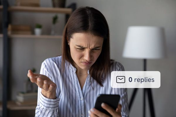
We all know the rules: research, personalize, automate. So why does it still fall flat? Here is why "Show Me You Know Me" matters more than just dropping a name.

Conversion Optimization
A brilliant ad means nothing if the landing page tells a different story. See real examples of "message mismatch" from top SaaS brands and learn how to fix this expensive mistake.

Conversion Optimization
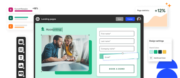
Vague headlines, message mismatch, and busy layouts are silently killing your results. Here are the 5 things visitors hate about your landing page – and exactly how to fix them.
Conversion Optimization
The old "no navigation" rule might be hurting your Google Ads performance. Learn how to align your pages with Google's new landing page experience standards.
casestudy
Removing one step led to a 99.5% increase in conversions. Here is how we audited the BetterWorld signup flow to find and fix the friction.
Conversion Optimization
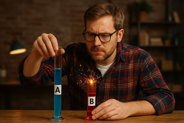
The hard part isn't running the test; it's deciding what to test in the first place. Here is how to stop guessing and start prioritizing your highest-value experiments.
casestudy
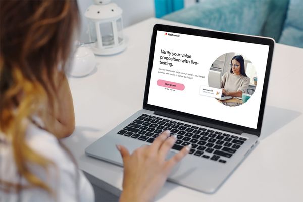
We challenged the standard "Book a Demo" flow and tested a direct signup option instead. The result? A 52% uplift in conversions. Here is the full case study.
Conversion Optimization
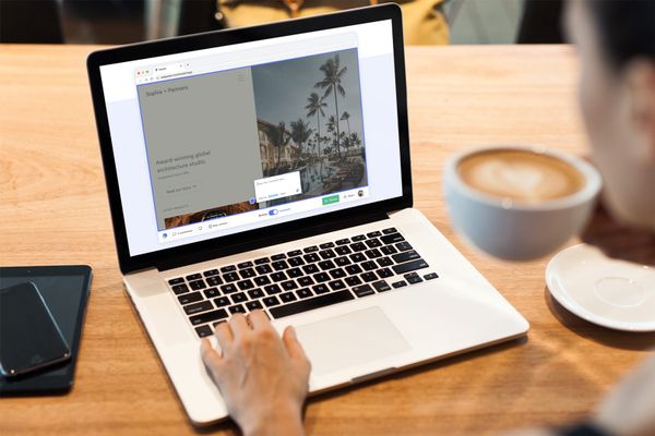
Email ping-pong is killing your agency's efficiency. Here is the exact tool and workflow I use to get visual feedback on landing pages and cut approval time in half.

Conversion Optimization
We tested a "dense" layout vs. a "clean" layout for a leading point-of-sale provider. The result? A 32.8% lift in engagement. Here is why whitespace wins.

Conversion Optimization
Is your signup flow too complicated? We removed the initial email field for BetterWorld and saw a 99.5% increase in signups. Here is why simpler is almost always better.
Conversion Optimization
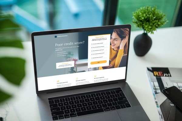
Complex forms scare away leads. We tested a simplified, cleaner form layout for HomeLoanGurus and achieved a 15% uplift. Here is the breakdown.