What I look for in the first 10 seconds of a landing page audit
You don't need hours to spot conversion blockers. Here is exactly what I look for in the first 10 seconds to determine if a page has the clarity to convert.


You don’t need hours of analysis to spot what’s holding your page back
When I review a landing page for the first time, I spend the first 10 seconds just looking. No scrolling, no clicking – just taking it in the same way a new visitor would.
That short moment reveals a lot. In fact, it’s often enough to tell whether a page will convert or confuse.
Over the years, I’ve developed a kind of mental checklist – things I instinctively look for right away. It’s not about design preferences or best practices. It’s about what the visitor understands, feels, and expects in those first few seconds.
1. Clarity of purpose
Can I tell what this page is about – instantly?
If I need to read the headline twice or scan for clues, that’s a red flag. Visitors don’t work to understand your message – they move on.
A strong opening communicates what you offer, who it’s for, and what happens next – all above the fold. That’s not easy, but it’s what separates pages that convert from pages that confuse.
Quick check: Ask someone unfamiliar with your product, “What’s this page about?” after 5 seconds. Their answer is usually more accurate than your analytics dashboard.
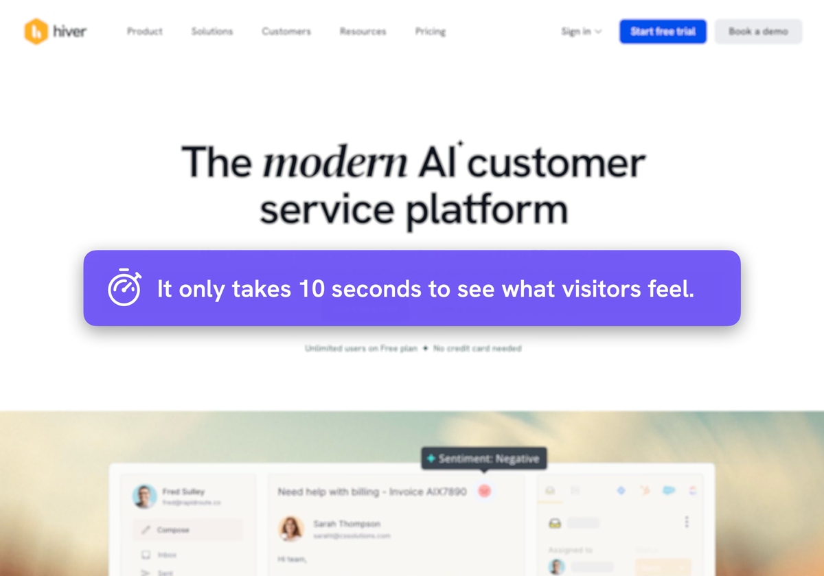
Here’s an example from Hiver where a slight headline shift could make a significant impact.
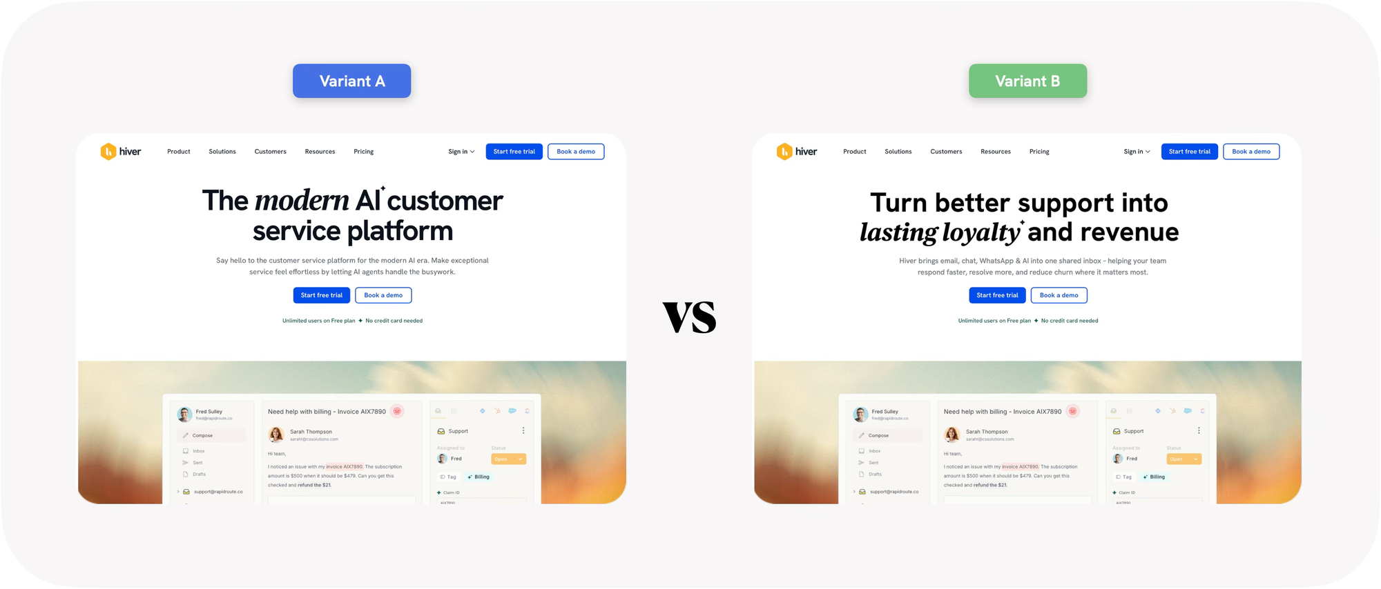
Why the version on the right wins:
Hiver’s current headline describes what the product is — “a modern AI customer service platform.” It’s clear, but it doesn’t connect the solution to a real-world result or value.
A modern platform in itself isn’t the value – lasting loyalty and revenue is.
The revised version shifts focus from the product to the outcome — turning “what it is” into “what it helps achieve.” That simple change makes the message instantly more relevant and persuasive.
2. Message match
Does the headline align with the ad, email, or link that sent me here?
If the message or tone shifts between the source and the landing page, visitors feel lost – even if they can’t explain why. This is one of the fastest ways to kill conversions.
Consistent language reassures visitors they’re in the right place. It also helps your ad spend go further because every click feels like a continuation, not a reset.
3. Visual hierarchy
Where does my eye go first?
The first few seconds are all about scanning – not reading. If the design doesn’t guide my attention, the message gets lost.
Contrast, whitespace, and directional cues help visitors know what matters. If everything shouts, nothing stands out.
Quick check: Squint your eyes. Can you still tell where the focus should be?
One quick way to evaluate visual hierarchy is to look at how the eye naturally travels across the page. Most users follow a Z- or F-shaped pattern, so your layout should support that path rather than fight it.
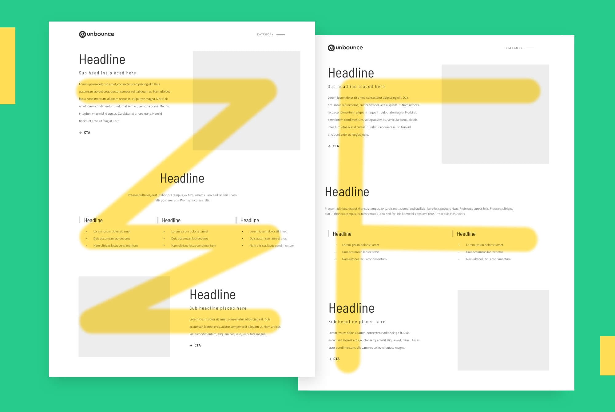
When I audit a page, I often blur the layout or trace this same eye path to see where attention naturally lands.
If the primary CTA doesn’t sit along that path — or if competing elements pull attention away — the design isn’t supporting conversion.
The best pages make the visitor’s journey effortless by guiding the eye toward one explicit action.
Contrast plays a significant role here, too.
If everything has the same visual weight, nothing feels important – and your call to action disappears into the noise.
A high-performing page creates contrast between primary and secondary elements:
- Headlines in bold or darker color
- Supporting copy in softer tones
- CTAs that clearly pop against the background
When your CTA sits naturally at the end of the visual flow and contrasts with its surroundings, visitors don’t have to search for what to do next — their eyes simply land there.
4. Emotional connection
What feeling does the page create?
Trust, excitement, curiosity, reassurance – these emotions drive conversion.
But clutter, jargon, or stock imagery kill it fast.
Visual tone and copy need to work together. When done right, the visitor feels understood before they’ve read a word.
5. Friction signals
Do I sense hesitation?
Tiny things can make a big difference:
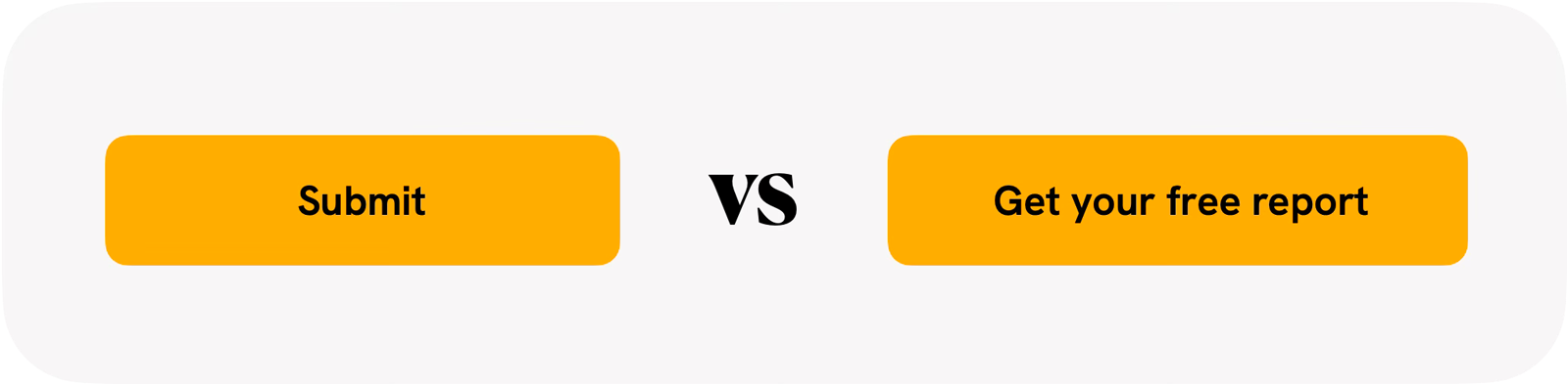
- “Submit” buttons instead of clear CTAs
- Forms that ask for too much
- Social proof that feels generic or outdated
If something makes me pause in the first 10 seconds, it’ll make your visitors bounce.
What happens after the first 10 seconds
After those first few seconds, I dive deeper into the data, flow, and conversion path – but I already know the story I’m looking for.
Those initial 10 seconds aren’t about judging design. They’re about understanding whether your landing page immediately builds clarity, relevance, and trust – or whether it needs help doing so.
Want fresh eyes on your landing page?
If you’d like me to review one of your pages with this 10-second lens, I’m happy to take a look.