Is your signup flow helping – or hurting – your conversions?
Removing one step led to a 99.5% increase in conversions. Here is how we audited the BetterWorld signup flow to find and fix the friction.

Most marketers assume their signup flow is “simple enough.” But friction doesn’t always look like broken buttons or long forms—it can hide in a single extra click.
In a recent A/B test we ran at ConversionLab, we helped a fundraising platform nearly double their signup rate by removing just one step. Here’s what we learned—and how to apply it to your own funnel.
The hidden friction in your flow
Even a clean-looking signup page can create unnecessary resistance. We often see:
- Redundant steps (like email gates before a form)
- Unclear CTAs
- Weak value messaging above the fold
These slow your users down—and a slow user is a lost user.
The BetterWorld experiment
We tested two signup flows:
- Variant A: A single email field, followed by the signup form
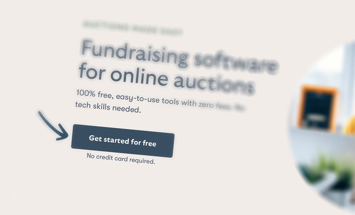
- Variant B: A direct CTA button leading straight to the signup form


Result? A 99.5% increase in conversions. By removing the extra step, we made the path to conversion effortless.
What this means for your landing page
Ask yourself:
- Are you making users do more than they need to?
- Are you capturing data too early—or too late?
- Can you simplify without losing clarity?
Conclusion: Simplify to convert
You don’t always need to redesign your whole funnel. Sometimes, it’s just about removing the unnecessary. Want help spotting your friction points?


