How to know what to A/B test (and what to leave alone)
The hard part isn't running the test; it's deciding what to test in the first place. Here is how to stop guessing and start prioritizing your highest-value experiments.


It’s tempting to test everything. Button colors. Font sizes. Entire pages. But not every A/B test is worth running—and not every idea will move the needle.
If you're wondering what to test next, this post is for you.
Not all tests are created equal
The best A/B tests start with a clear hypothesis and address a real user pain point. But in reality, many teams waste time testing things that:
- Don’t have enough traffic to reach significance
- Aren’t based on data or observed behavior
- Solve the wrong problem entirely
So, what should you test?
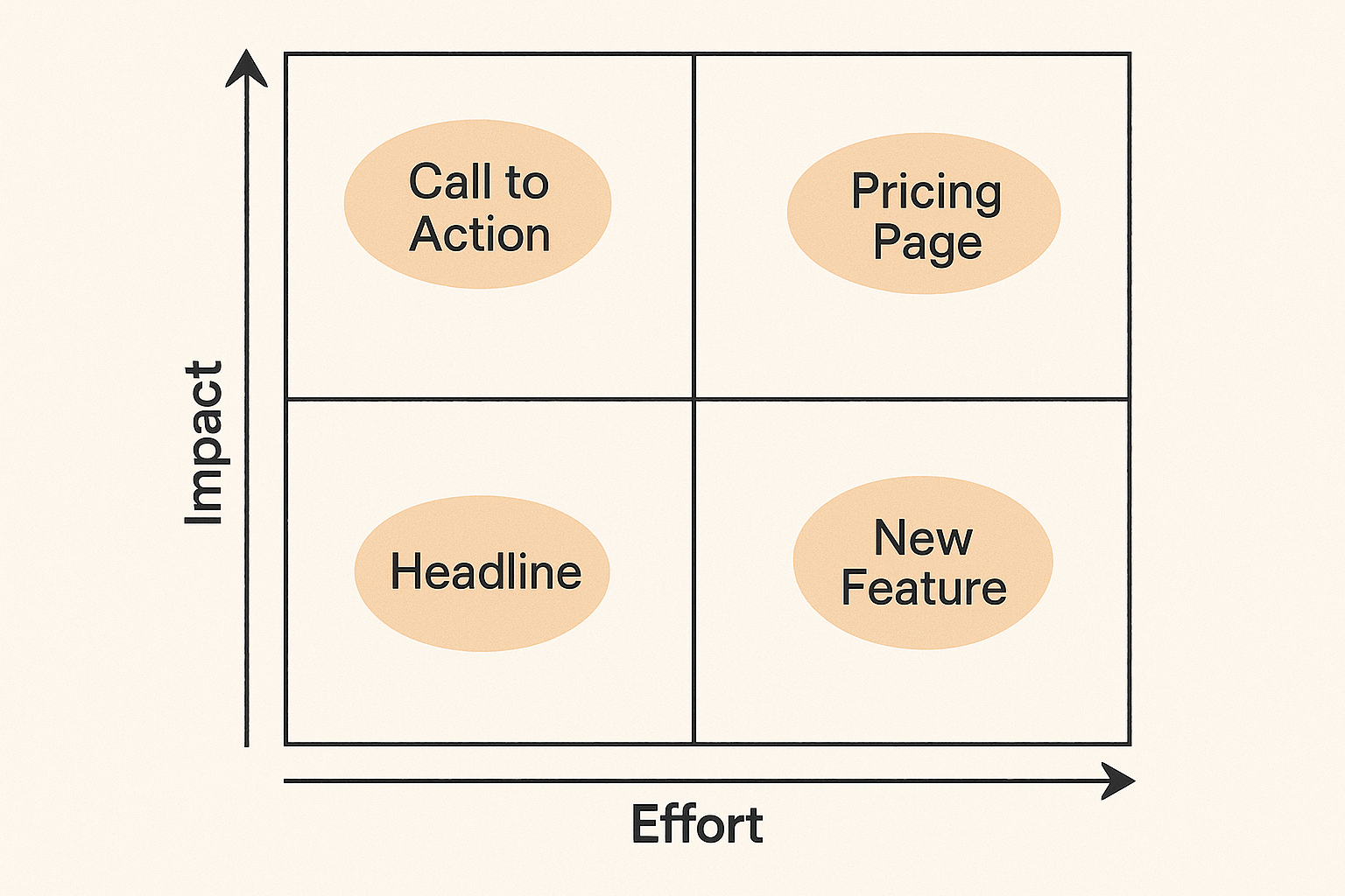
We use a simple prioritization filter at ConversionLab:
- Impact: Will this change affect a key metric like conversions or signups?
- Effort: How hard is it to implement?
- Confidence: Do we have data or user signals to back it up?
Start with tests that score high on impact and confidence, and low on effort. And always tie your test idea to a specific user behavior.
Examples we’ve tested recently
- Removing friction from signup flows → 99.5% CVR uplift
- Simplifying landing page layout → 32.8% CTR uplift
- Adding visual cues to direct attention → 52% increase in button clicks
What not to test (yet)
- Tiny cosmetic changes with no user feedback to support them
- Copy tweaks that don’t relate to the core value prop
- Pages with too little traffic to run a reliable test
These aren’t off the table forever. Just focus first on the changes that will deliver signal, not noise.
Want help prioritizing your next test?
We can help you identify what’s worth testing—and what to leave alone for now.