Case study: Streamlining the path to signup for better conversion rates
Is your signup flow too complicated? We removed the initial email field for BetterWorld and saw a 99.5% increase in signups. Here is why simpler is almost always better.

At ConversionLab, we specialize in designing and executing strategic A/B tests to help clients like BetterWorld achieve better results from their landing pages. Recently, we partnered with BetterWorld to improve the signup journey on their fundraising platform. The goal was simple: reduce friction and increase conversions by simplifying the path to sign up.
Objective
We set out to test whether removing the email field on the initial landing page and replacing it with a single, prominent call-to-action (CTA) button would reduce distractions and lead to a higher conversion rate (CVR) on the signup page.
Test details
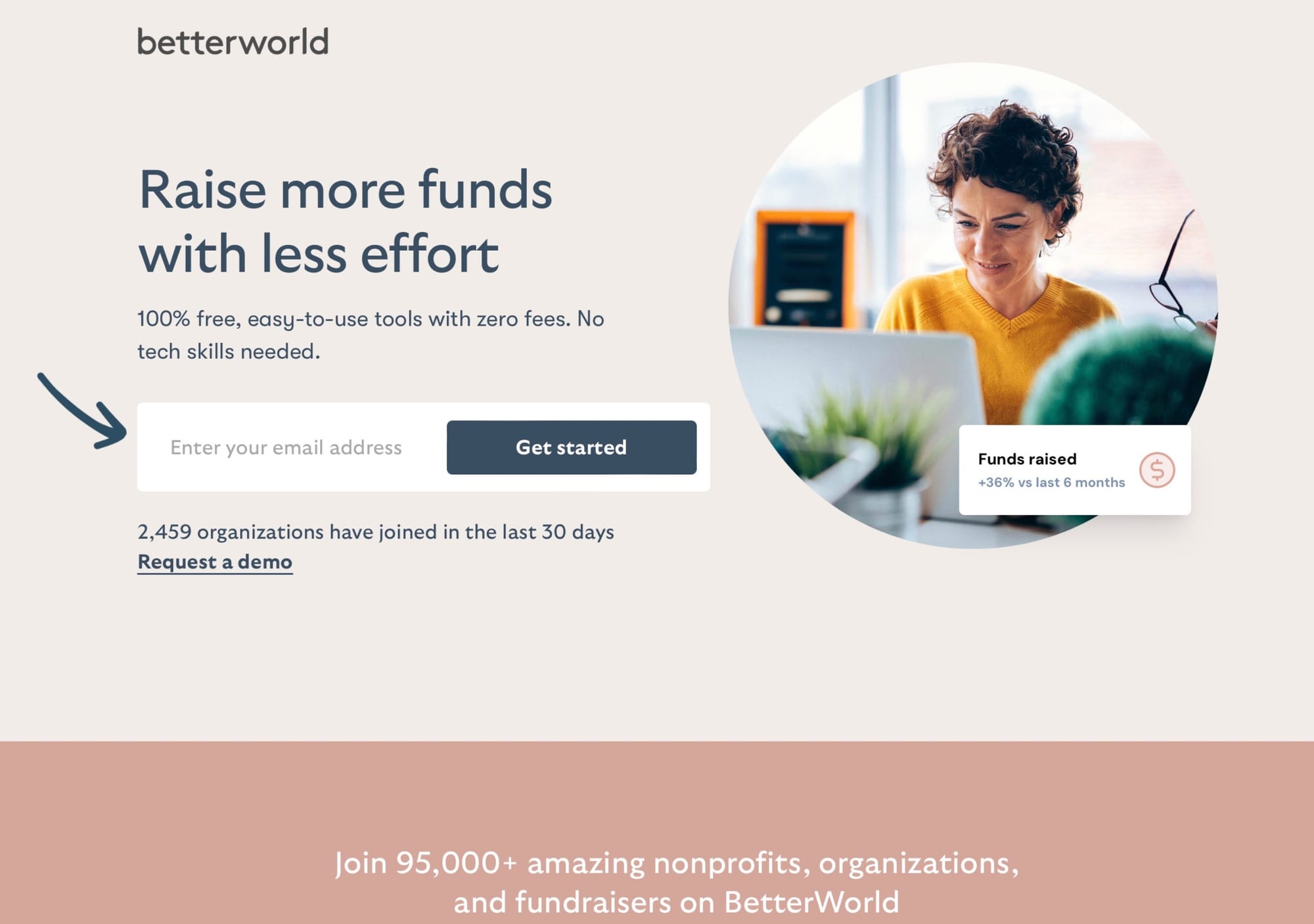
Variant A (Control):
Included a single email field on the landing page as the first step in the signup process. Visitors who entered their email were then directed to the full signup page, where they completed their details.

This approach added an extra layer of friction, as visitors had to complete two separate steps.
- Conversion rate (CVR): 5.1%
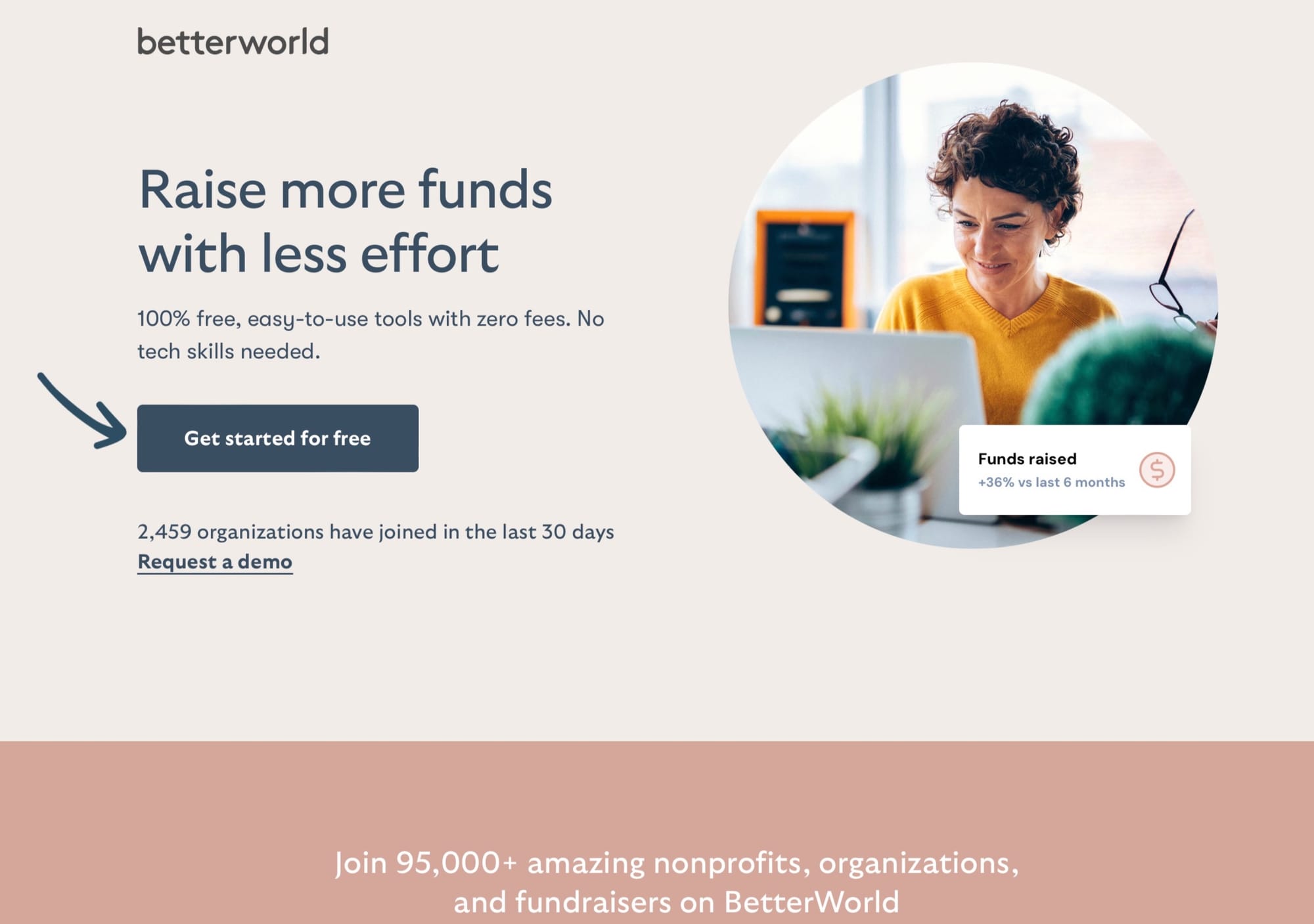
Variant B (Challenger):
Removed the email field entirely and replaced it with a single, prominent CTA button ("Get started"), directing visitors directly to the full signup page.

This streamlined the process and reduced the cognitive load for visitors.
- Conversion rate (CVR): 10.2%
Variant B was the clear winner, achieving a 99.5% uplift in CVR and demonstrating statistical significance at 100%.
Key insights and takeaways
- Simplifying the journey increases engagement
By replacing the initial email field with a CTA button, Variant B streamlined the path to sign-up, reducing friction and making the user experience more intuitive. - Reducing cognitive load drives action
Visitors faced fewer decisions and distractions with Variant B, allowing them to focus on completing the full signup form on a single page. - The power of data-driven decisions
This test highlights the value of A/B testing in uncovering small but impactful changes that can significantly improve conversion rates. For BetterWorld, this simple adjustment nearly doubled sign-ups during the test period.
Why this matters for BetterWorld
Non-profits often operate with lean teams and limited time, so tools that simplify fundraising processes are invaluable. This test demonstrates how BetterWorld’s dedication to improving the user journey aligns with its mission to make fundraising easy and accessible for all organizations.
If your organization wants to achieve similar results, let’s connect. Together, we’ll uncover opportunities to optimize your customer journey and grow your impact.


