How we helped Campaign Monitor achieve a 1187% increase in conversion rates
A 1187% cumulative increase in conversion rates and a 64% reduction in CAC – achieved through 33 A/B tests across 10 landing pages over a sustained CRO retainer. This is the full story of how we did it.


We ran 33 A/B tests for Campaign Monitor across 10 landing pages over the course of a sustained CRO retainer. The cumulative result was a 1187% increase in CVR and a 64% reduction in customer acquisition cost. This is the full story of how we did it.
ConversionLab played a key role in accelerating Campaign Monitor's growth by optimizing our landing pages for maximum performance. We increased conversion rates by 260% in the first 6 months and 1187% cumulatively across the full engagement, and saw a 64% reduction in customer acquisition cost. We are very happy with the results!
Shamita Jayakumar, Senior Marketing Manager, Campaign Monitor
The client
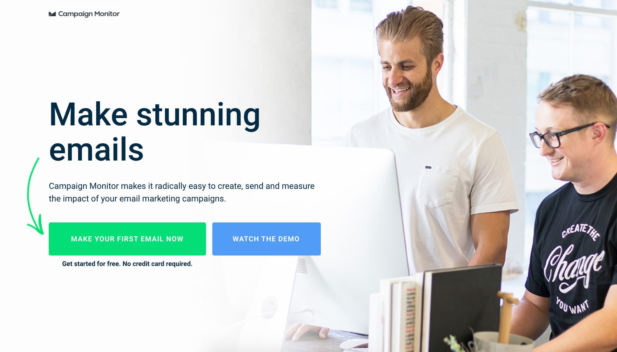
Campaign Monitor is one of the world's leading providers of email marketing and automation software. At the time of our engagement, more than 2 million people at 200,000 companies worldwide – including BuzzFeed, Coca-Cola, and Disney – used Campaign Monitor to run email marketing campaigns.
Their primary acquisition goal was straightforward: convert more paid search traffic into free trial signups. The traffic was performing well. The landing pages were not.
The challenge
Before working with ConversionLab, Campaign Monitor had no dedicated process for conversion rate optimisation. Their PPC agency was delivering strong click volumes, but the gap between clicks and signups was wide and largely unexamined.
Nobody was systematically asking: what happens after the click?
That question – and the discipline to answer it with data rather than assumptions – was the foundation of everything that followed.
Our approach
We treated Campaign Monitor's landing pages as a product. Not a one-off project or a quarterly refresh – a continuously iterated, hypothesis-driven system where every change was tested before being implemented.
The process on every test was the same:
- Identify a friction point or opportunity through data and observation
- Form a specific, directional hypothesis
- Design a challenger variant that tests one meaningful change
- Run the test until reaching statistical significance (minimum 95%)
- Document the result and use it to inform the next hypothesis
Some tests won. Some lost. Some were stopped early when the data showed the challenger was underperforming. That rigour – being willing to kill a test and move on – is what made the cumulative result possible.
Over the course of the engagement, we ran 33 tests across 10 page types: email marketing, best email marketing, newsletter, mass email, email design, HTML email, templates, the Modern Guidebook, brand pages, and the ESP page. The average uplift per winning test was 36%.
The five tests that defined the engagement
1. Dynamic text replacement: 57% uplift
The hypothesis: if we match the landing page headline to the exact verb a visitor used in their Google search query, we increase perceived relevance and improve conversion rate.
What we tested: using Unbounce's dynamic text replacement feature, the headline and CTA on Campaign Monitor's email marketing landing page automatically swapped to reflect the search term the visitor had typed. Someone searching "design emails" saw "design" in the headline. Someone searching "create emails" saw "create." The control used a fixed, previously high-performing headline.

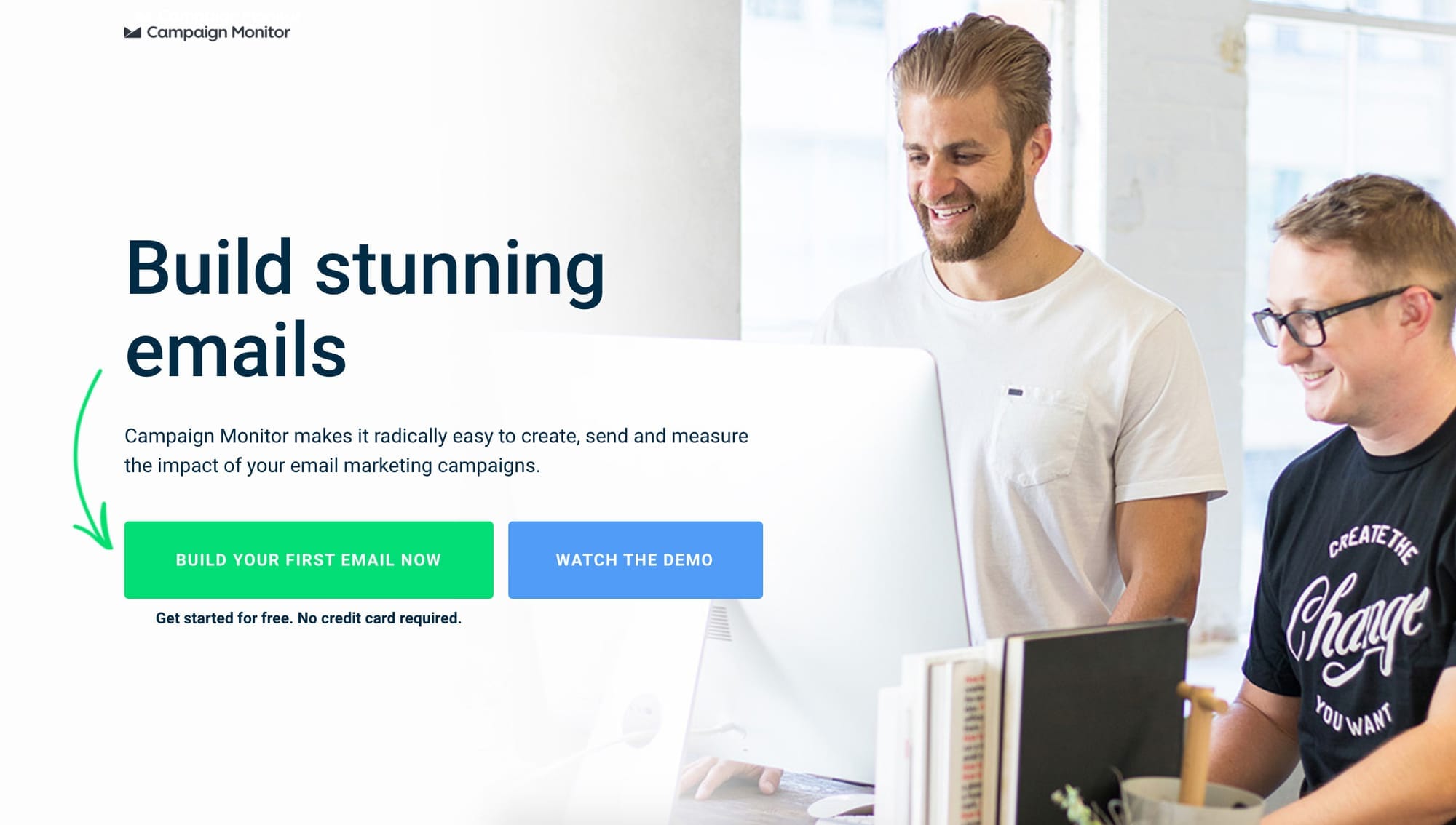
The result: the dynamic headline variant produced a 58% uplift in conversion rate. In other words, that single change delivered 58% more free trial signups from the same paid traffic.
Why it worked: the visitor arrived with a specific intent – a word in their head that described what they wanted to do. When the landing page reflected that word back at them, the page felt immediately relevant. When it didn't, there was a fraction-of-a-second hesitation: "is this what I was looking for?" That hesitation is enough to lose a significant proportion of visitors.
This principle – message match between ad and landing page – became the foundation of our work across all subsequent pages.
2. Exit intent popup: 197% uplift in clicks, 271 leads in one month
The hypothesis: a significant proportion of visitors who are about to leave the page without converting have not definitively rejected the offer – they are simply not ready to commit to a trial. An exit intent popup offering lower-commitment content (a guide rather than a signup) would capture a portion of these visitors into a lead nurture flow.
What we tested: an exit intent overlay triggered when a visitor moved their cursor toward the browser's address bar or back button – a reliable signal of intent to leave. The popup offered Campaign Monitor's email marketing guide in exchange for an email address.
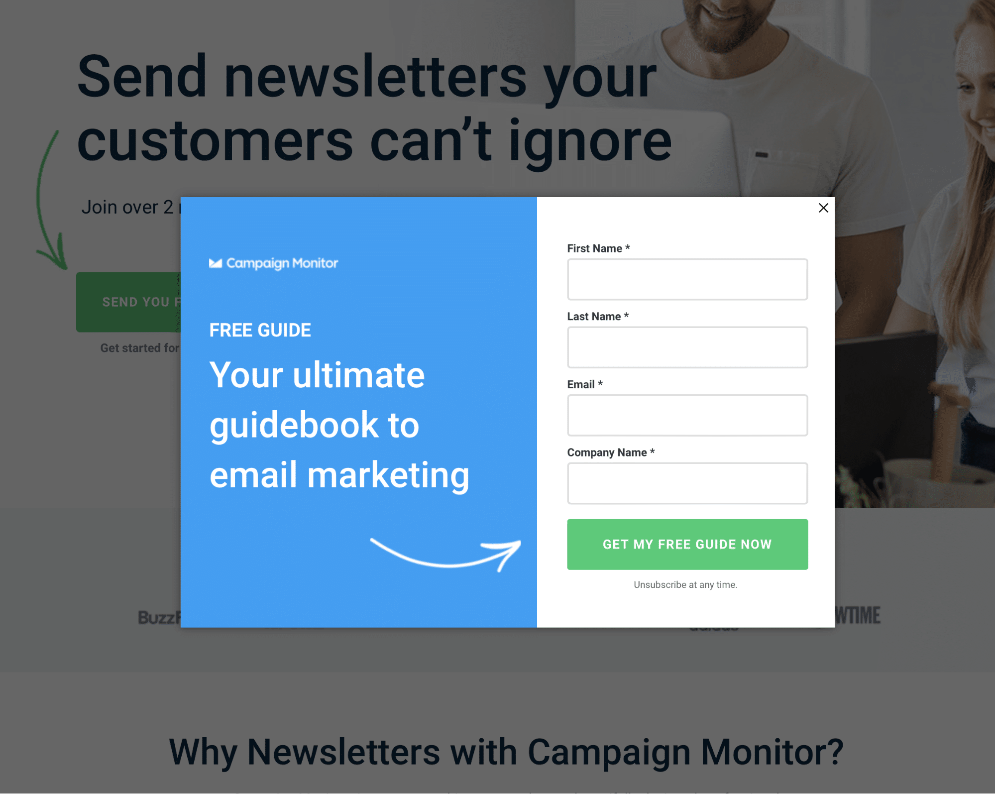
The result: 10.8% of otherwise abandoning visitors converted through the popup. In the first month alone, 271 visitors who would have left without any engagement were converted into leads and entered a nurture flow.
Why it worked: the popup met visitors at precisely the moment their intent was clearest – they were leaving – and offered them a smaller commitment than a trial signup. Many of these leads subsequently converted to trial users through the nurture sequence, making the exit intent layer one of the highest-ROI additions of the engagement.
3. Specific CTA copy: 120% uplift
The hypothesis: a CTA button that names the specific outcome the visitor is seeking will outperform a generic action-oriented button.
What we tested: on a landing page themed around newsletters, we replaced the CTA button text "Get started for free" with "Get your free newsletter tool." The generic text moved to a supporting position below the button as trigger text.
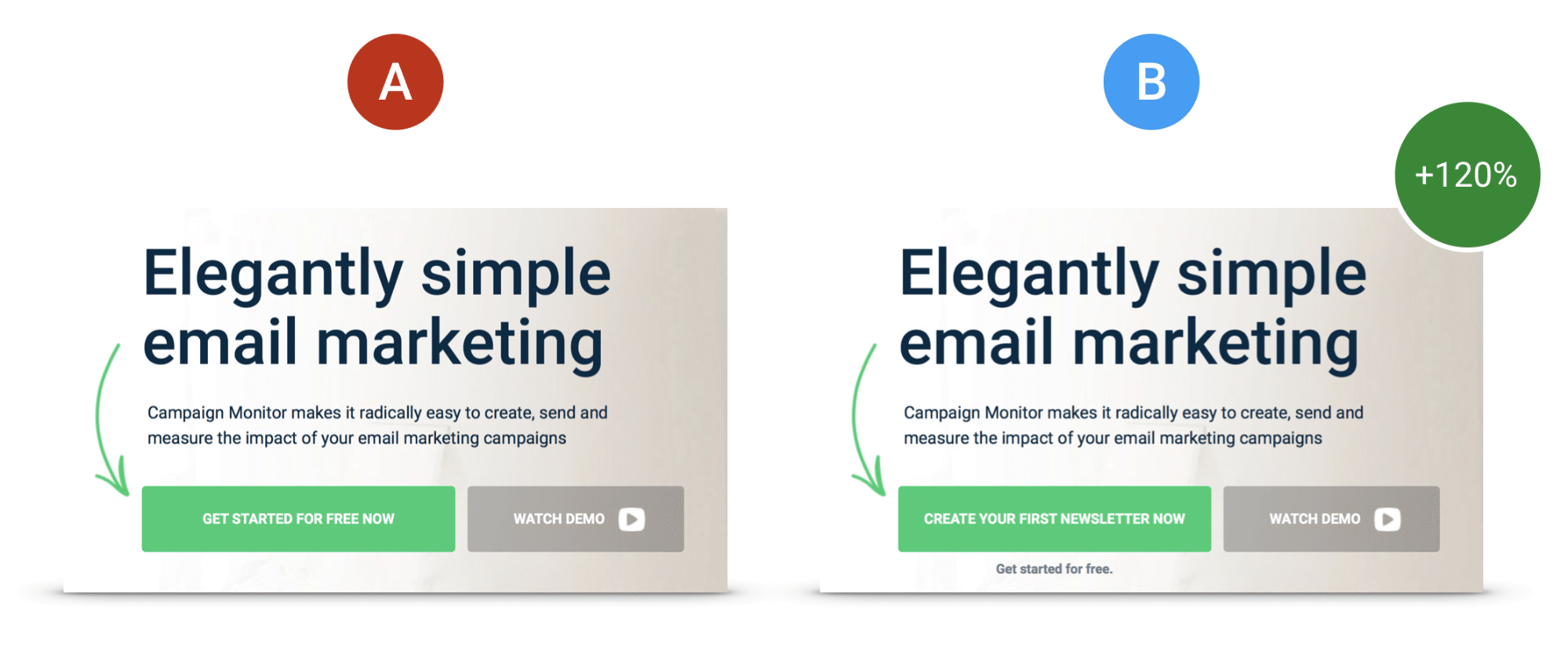
The result: 120% increase in conversion rate.
Why it worked: "Get started for free" is a promise of an action. "Get your free newsletter tool" is a promise of an outcome. Visitors who arrived on that page had searched for newsletter-related terms. The specific CTA confirmed they were in the right place and getting exactly what they came for. The generic version left a small but conversion-killing gap between what they wanted and what the button offered.
This test is one of the clearest illustrations of why specificity always beats generality in CTA copy.
4. Anxiety reduction: 78% uplift
The hypothesis: a proportion of visitors who reach the CTA but do not convert are hesitating because of uncertainty about what happens next – specifically, whether a credit card is required to start a trial. Making this explicit will remove the hesitation and increase conversions.
What we tested: we added the line "No credit card required" directly below the CTA button. Nothing else on the page changed.

The result: 78% increase in conversion rate.
Why it worked: Campaign Monitor's trial had never required a credit card. But because this was not stated on the page, visitors who had been burned by "free trial" signups elsewhere assumed it might. Uncertainty is one of the most powerful conversion blockers because it is invisible – it does not show up in heatmaps or click data, it just quietly prevents people from acting. Naming and removing the uncertainty directly at the point of decision eliminated the hesitation for a large proportion of visitors.
5. Checkmarks on signup form: 75% uplift
The hypothesis: adding visual progress indicators to a multi-step signup form will increase completion rates by reducing cognitive load and giving visitors a sense of forward momentum.
What we tested: we added checkmarks to the signup form fields that illuminated as each field was completed, giving visitors a visual signal that they were progressing toward their goal.
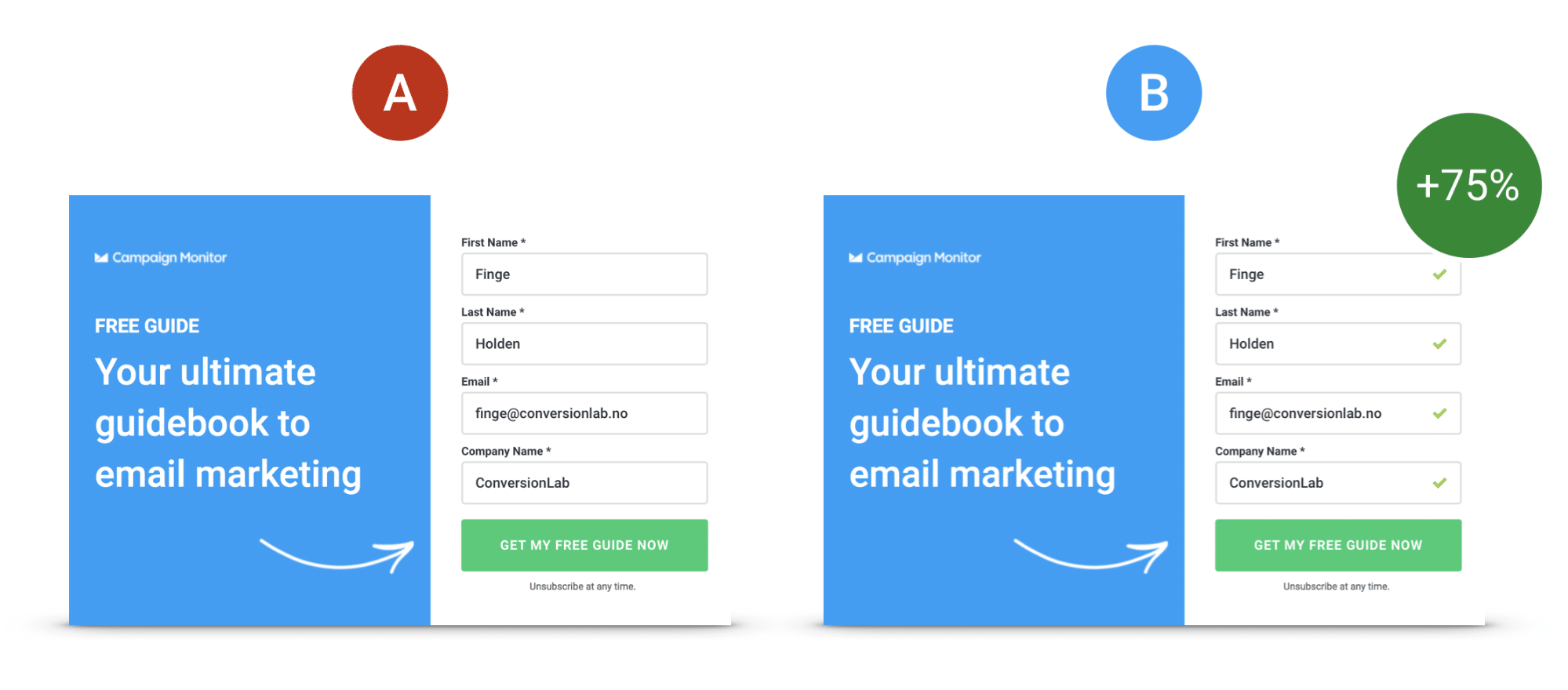
The result: 75% increase in conversion rate.
Why it worked: completion is psychologically easier when progress is visible. The checkmarks did two things simultaneously: they reduced the anxiety of "how much more do I have to fill in?" and they created a small dopamine signal with each completed field that reinforced the behaviour of continuing. A minor usability detail with a major conversion impact.
What the data showed about compounding
One of the most important lessons from this engagement is the compounding nature of systematic optimisation.
In the first 6 months, cumulative CVR improvement was 260%. By the end of the full engagement – 33 tests across 10 pages – the cumulative total reached 1187%.
This is not because the later tests were more impactful than the earlier ones. It is because each winning test raised the baseline from which the next test started. A 36% uplift applied to a page already performing 260% better than it did at the start of the engagement produces a much larger absolute improvement than the same 36% applied to the original baseline.
This compounding effect is why sustained retainer-based CRO consistently outperforms one-off optimisation projects. A single sprint might find and fix the most obvious friction points. A sustained engagement finds everything else.
The outcome
| Metric | Result |
|---|---|
| Total A/B tests performed | 33 |
| Pages tested | 10 |
| Average CVR uplift per winning test | 36% |
| Cumulative CVR uplift | 1187% |
| Reduction in customer acquisition cost | 64% |
| Abandoning visitors converted via exit intent (month 1) | 271 |
What this means for your funnel
The five tests above share a common thread: none of them required a page redesign, a new product feature, or additional ad spend. Every uplift came from a more precise understanding of what visitors needed at each moment in their journey – and a small, testable change that delivered it.
The traffic was already there. The intent was already there. The gap was between what visitors expected and what the page delivered.
That gap exists on almost every SaaS landing page we audit. The only question is how large it is and how much it is costing in wasted ad spend.
If you are running paid acquisition and you are not systematically testing your landing pages, you are leaving a significant proportion of your budget on the table every month.
Want to know what that gap looks like on your pages?
I offer a free audit – a focused, personal review of one landing page you are actively using to drive conversions. I will tell you exactly what I see, what is blocking conversions, and what I would fix first.
This case study draws on work originally co-authored with Campaign Monitor and featured on the Campaign Monitor blog and covered by Unbounce.