The blueprint for high-converting landing pages
A simple framework for landing pages that convert. Learn how to structure your headline, hero, benefits, form, and trust elements for maximum impact.
This is tip #3 in an 8-part Ultimate Guide to Conversion Optimization. Want the full guide delivered to your inbox? Get it here →
Start with the call to action
Everything on a landing page should ladder back to a single, clearly defined CTA. Before designing anything, decide on the action you want visitors to take. That decision becomes the foundation for your headline, layout, imagery, and supporting content.
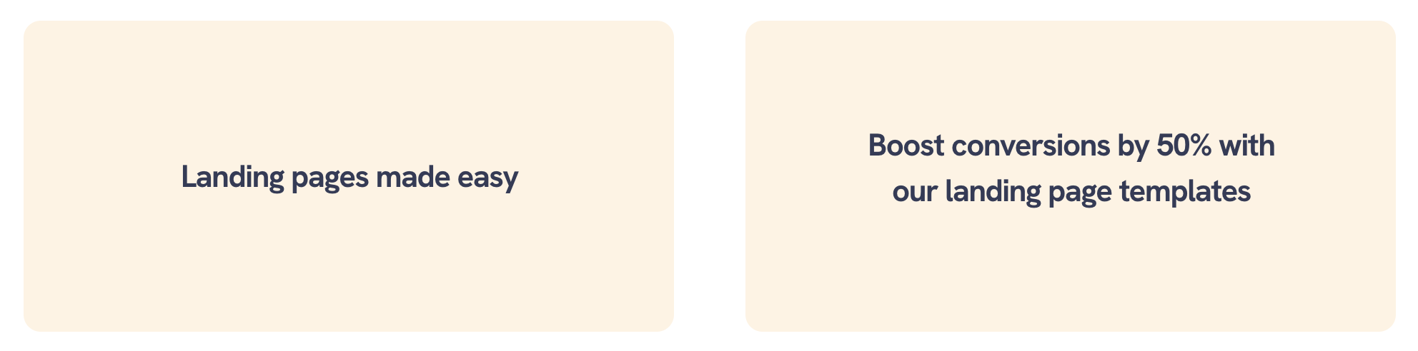
1. Write a headline that reinforces your CTA
A strong headline makes your promise immediately clear. It should be specific, benefit-driven, and aligned with the outcome your CTA delivers.
2. Use a hero section that supports your message
Your hero isn’t decoration. It should help visitors understand your offer faster. Use imagery that:
- reinforces your headline
- illustrates your product or outcome
- visually guides the eye toward the CTA

3. Make the value obvious through clear benefits
People skim, so benefits should be short, scannable, and visitor-focused. Avoid feature lists. Make each bullet answer the question: “Why should I care?”
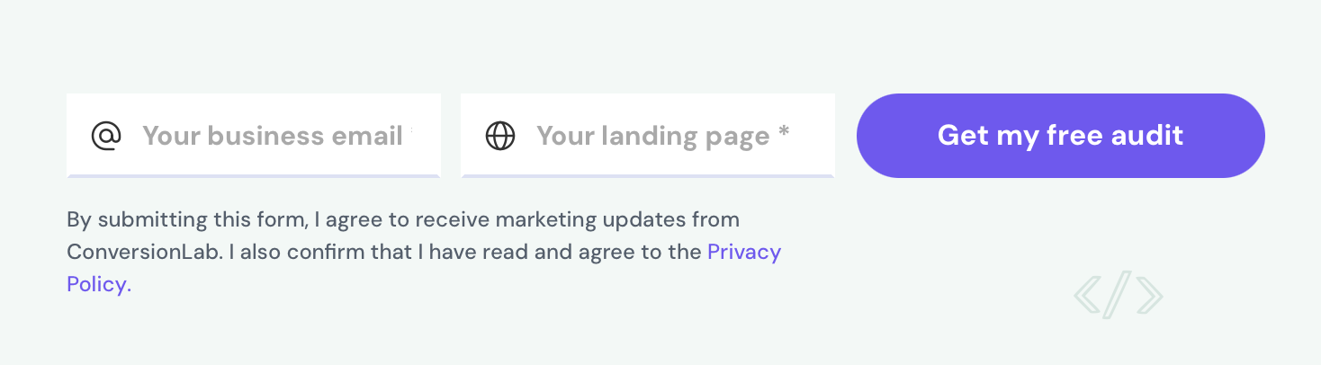
4. Keep your form as short as possible
Every unnecessary field creates friction. Ask only for what you truly need. More fields means fewer conversions.
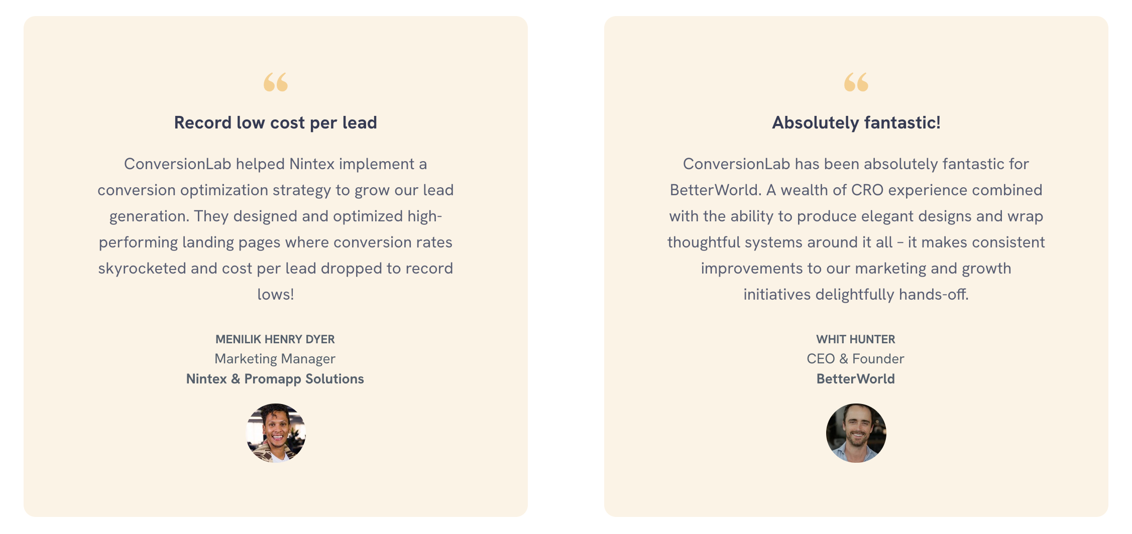
5. Add trust indicators to reduce hesitation
Use testimonials, logos, data points, or quotes to build confidence. Trust indicators should sit close to the form so they reinforce the decision to convert.
6. Use a clear, benefit-driven CTA
Your CTA is the final step in the visitor’s decision. Make it specific and action-oriented.
- Use benefit-driven text like “Get the free guide” or “Start my trial”
- Avoid vague language like “Submit” or “Click here”
- Make sure the CTA reinforces the outcome promised in the headline
Checklist: does your landing page follow the blueprint?
- CTA defined first – before designing the page
- Headline reinforces the CTA
- Hero supports the visual message
- Benefits are short, scannable, and visitor-focused
- Form asks only for essential fields
- Trust indicators build credibility
If you haven’t already, check out Tip #1 (The gorilla & the banana) to understand why focus is everything — and Tip #2 for why dedicated landing pages outperform general pages.
Key takeaway
A high-converting landing page is built around a single action. Once your CTA is clear, every element on the page should work together to drive attention toward it. Start with clarity, remove distractions, and use strong visuals to guide visitors forward.
Want all 7 tips in your inbox?
Get The Ultimate Guide to Conversion Optimization – a free 7‑part email series with the most effective CRO tips I’ve learned from 12 years of landing page testing.
Want personal feedback on one of your landing pages?
Send me the URL and I’ll take a look. Quick, actionable and free.
👉 Get your free audit