The gorilla and the banana 🦍🍌
Your visitor is the gorilla and your offer is the banana. When your landing page shows them a fruit basket instead of the banana they clicked for, conversions drop fast. Here is how to fix it.
This is tip #1 in an 8-part Ultimate Guide to Conversion Optimization. Want the full guide delivered to your inbox?
Get it here →
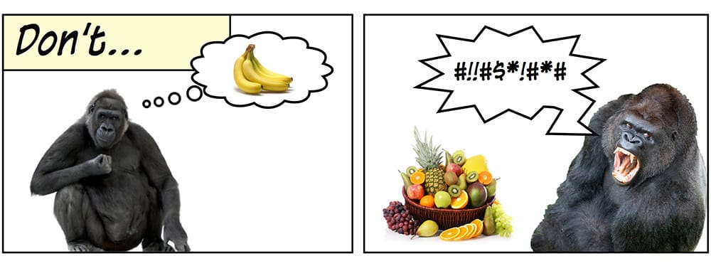
Your visitor is the gorilla. Your offer is the banana. They clicked your ad because you promised them one thing.
The problem
Most landing pages greet the gorilla with a fruit basket instead of the banana they expected. That means:
- Too many options
- Competing CTAs
- Navigation menus
- Mixed messages
- Unclear next steps
When visitors need to search for what they were promised, they get frustrated. Frustrated visitors do not convert.
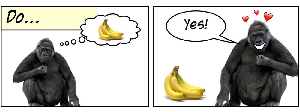
The principle
A high‑converting landing page gives the gorilla exactly what they came for:
- One offer
- One action
- No competing fruits
This is the core of attention ratio. The clearer the page, the smoother the path to conversion.
Attention ratio: one page, one offer, one action. The fewer bananas, the higher your conversion rate.
🦍 + 🍌 = ❤️
Why it matters
Attention is a limited resource. When a landing page contains multiple CTAs, competing messages or distracting elements, your visitor needs to process more information than necessary. That friction reduces the likelihood that they will take the action you want.
A high-converting page gives the visitor one job and removes everything that competes with that job.
The tip in action
A good landing page has a 1:1 attention ratio. That means one purpose for the page and one clear action for the visitor.
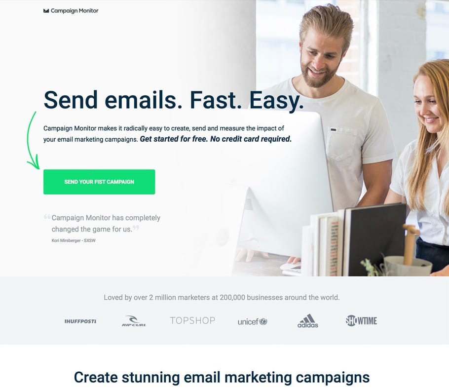
Bad example: too many bananas
Good example: one banana, one action
The difference is clarity. When the visitor sees exactly one action, they are far more likely to take it.
Why it works
A single, focused CTA lowers cognitive load and helps visitors understand what the page is asking them to do. By removing competing elements, you create a natural visual hierarchy that supports the primary goal.
This principle is the foundation of effective landing page design and connects directly to Tip 2, which expands on why dedicated landing pages consistently outperform general pages.
Checklist
- Is there only one primary action you want the visitor to take?
- Are there any competing CTAs or links that distract from that action?
- Does the hero section focus on the main value and CTA, without unnecessary elements?
- Is the navigation removed or minimized to avoid escape routes?
- Does the design reinforce a clear visual path to the CTA?
Key takeaway
Your landing page should make the next step obvious. When you give visitors multiple choices, you weaken your message. When you give them one clear action, you strengthen it. The gorilla always goes for the single banana.
Next: Always use dedicated landing pages
Want all 7 tips in your inbox?
Get The Ultimate Guide to Conversion Optimization – a free 7‑part email series with the most effective CRO tips I’ve learned from 12 years of landing page testing.
Want personal feedback on one of your landing pages?
Send me the URL and I’ll take a look. Quick, actionable and free.
👉 Get your free audit