Always use dedicated landing pages
See why dedicated landing pages consistently outperform website pages – and how a single, focused message can dramatically increase conversions.
This is tip #2 in an 8-part Ultimate Guide to Conversion Optimization. Want the full guide delivered to your inbox?
Get it here →
When you send paid traffic to a general website page, you’re asking visitors to do the heavy lifting. They land on a page with multiple paths, menus, distractions and mixed intents — and you hope they’ll somehow choose the action you want.
If you read The gorilla and the banana, you’ll remember the hungry gorilla who clicked an ad expecting a banana but landed on a page full of other fruits instead. 🦍🍌
Dedicated landing pages fix that problem by giving visitors exactly what they came for – immediately and without distraction.
A dedicated landing page removes all of that friction. It gives visitors one job, one message and one path forward.
Why your website isn’t built for conversions
Your website has many purposes:
- explain your product
- showcase your brand
- support SEO
- attract multiple audiences
- offer multiple navigation routes
This is great for exploration, but terrible for paid traffic.
Paid visitors aren’t browsing. They clicked on a specific promise. Your job is to meet that promise instantly.
Why dedicated landing pages work
Dedicated landing pages focus all attention on a single outcome — and that clarity almost always boosts conversion rates.
A strong landing page gives you:
- One clear offer instead of 10 competing ones
- One message instead of a mix of marketing, product, and SEO content
- One CTA instead of a full navigation bar
- One audience instead of trying to please everyone
Fewer decisions means less friction.
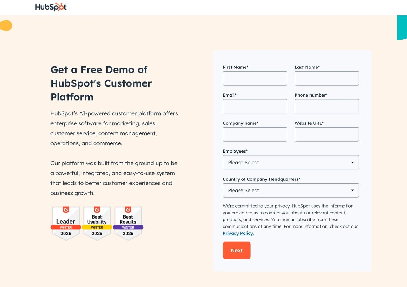
Website vs. landing page (real example)
Image 1 — HubSpot website
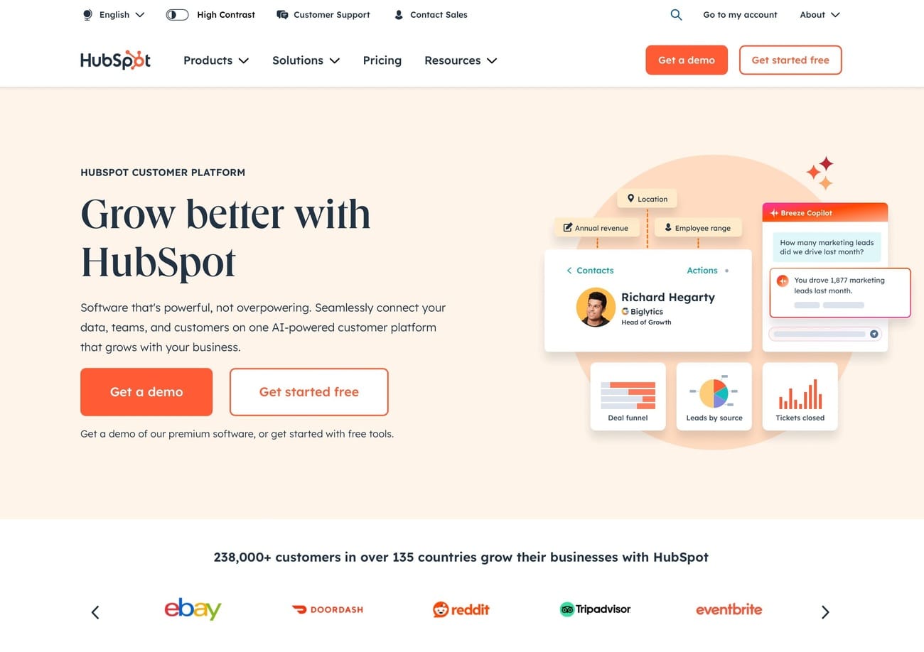
Image 2 — HubSpot dedicated landing page
When to use a dedicated landing page
Dedicated landing pages work especially well when:
- You run paid ads (Google, Meta, LinkedIn, YouTube)
- You promote a single offer or campaign
- You need message consistency from ad → page
- You want to test headlines, offers or layouts
- You want cleaner tracking and clearer attribution
If you pay for the click, the visitor should land on the most focused version of your message.
Checklist: is your page truly dedicated?
Make sure your landing page has:
- No top navigation
- 1 CTA only (no competing actions)
- A headline that matches the ad or email
- A single audience and a single offer
- No external links except your privacy policy
- Content written only to support the CTA
Key takeaway
Your website is built for exploration.
Your landing page is built for conversion.
When you remove competing paths and focus your message, visitors understand instantly what you want them to do — and are far more likely to do it.
Want all 7 tips in your inbox?
Get The Ultimate Guide to Conversion Optimization – a free 7‑part email series with the most effective CRO tips I’ve learned from 12 years of landing page testing.
Want personal feedback on one of your landing pages?
Send me the URL and I’ll take a look. Quick, actionable and free.
👉 Get your free audit