Focus on contrast, not color: make your CTA stand out
Contrast makes your CTA stand out and your landing page easier to use. Learn how to use contrast, encapsulation and spacing to guide visitors toward the action.
This is tip #5 in an 8-part Ultimate Guide to Conversion Optimization. Want the full guide delivered to your inbox?
Get it here →
Many marketers obsess over the perfect button color.
Red vs green. Blue vs orange.
A “best color for conversions” post might even go viral on LinkedIn.
But here’s the truth: color rarely matters on its own.
What matters is contrast.
If your CTA blends into the layout, the page forces the visitor to work harder.
If the CTA stands out clearly, the page becomes easier to use and conversions rise naturally.
Contrast grabs attention.
Cues guide attention.
Together they create a clear path to the action.
Why contrast matters more than color
Contrast helps the eye understand what is important on the page.
In almost every A/B test, CTAs that stand out visually beat CTAs that “match the brand palette” a little too well.
Contrast creates:
- faster scanning
- fewer missed CTAs
- clearer hierarchy
- stronger intent signals
- higher completion rates
No user ever complains that a CTA is “too easy to spot.”
How to use contrast to improve your CTAs
1. Make your primary CTA the most visible element
The CTA should be the first thing visitors notice.
If your page uses soft, neutral tones, a saturated CTA button instantly becomes the visual anchor.
2. Use encapsulation to elevate important elements
Encapsulation means putting the CTA, form or offer inside a box or container so it becomes its own focal point.
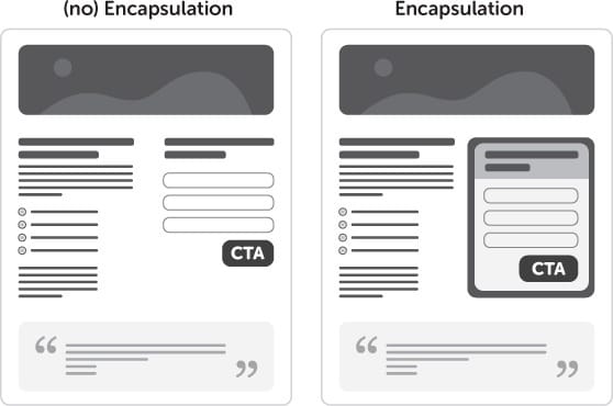
Even a thin border or lightly shaded box can increase conversions without changing your color palette.
3. Reduce visual noise around the CTA
If everything is bold, nothing stands out.
Remove distractions around your CTA:
- Reduce competing buttons
- Tone down nearby links
- Limit bright colors around the button
- Increase spacing around the CTA
Whitespace is contrast.
4. Avoid relying on color alone
A red CTA can underperform a grey CTA if the grey creates stronger contrast against the surrounding layout.
Color psychology is interesting, but not nearly as important as:
- positioning
- contrast
- clarity
- visual hierarchy
Your CTA color is only as strong as the elements around it.
Contrast + cues = clarity
Contrast attracts attention.
Directional cues guide attention.
Used together, they create a powerful, intuitive path toward your CTA.
(Optional mini-callout: link to Tip #6 once published)
Checklist: does your CTA stand out?
- High contrast between CTA and background
- Minimal distractions near the button
- Encapsulation used if needed
- Only one primary CTA
- Clear whitespace separation
- CTA is the most visually dominant element
- Visual and directional cues work together
Key takeaway
Color alone does not drive conversions.
Contrast does.
When your CTA clearly stands out from its surroundings, visitors instantly know what to do next.
Contrast makes your page easier to use, faster to understand and more effective overall.
Want all 7 tips in your inbox?
Get The Ultimate Guide to Conversion Optimization – a free 7‑part email series with the most effective CRO tips I’ve learned from 12 years of landing page testing.
Want personal feedback on one of your landing pages?
Send me the URL and I’ll take a look. Quick, actionable and free.
👉 Get your free audit